Design
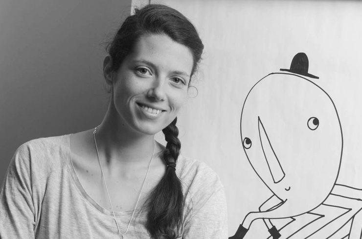
Dario Dević & Hrvoje Živčić: Design collaborators Part I
Recipients of the Zgraf 11 Welcome Award and named among the best New Visual Artists of 2011 by Print magazine (NYC), Dario Devi? and Hrvoje Živ?i? are known for creating bold visuals that are at once playful and intelligent, lo-fi and sophisticated.
The designers, who both have Master’s degrees in visual communications, also work solo, but they find that collaborating allows them to pool their strengths and play off each other’s individual styles. Working for clients “whose cultural output [they] also consume” – for example, nightclubs, curatorial collectives, and cinema clubs – also helps them keep their work fresh, authentic, and relevant.
In part one of our two-part interview with Devi? and Živ?i?, they tell us about their design values and working as a team.
How did you meet, and why do you choose to collaborate?
We both started our studies at the Zagreb School of Design in 2005. A couple of years later … we decided to make the Student Centre the subject of our bachelor’s thesis – our first big project together. [Afterwards] the SC’s culture branch … invited us to do some work for them. This collaboration (as well as the collaboration of the two of us) has been going on ever since.
Our individual styles in graphic design aren’t very similar, but we seem to have a shared visual sensibility: we can agree on what’s good and what’s not almost instantaneously, which may be an even better basis for collaboration. Even when we’re pulling in opposite directions, we always both know when something we’ve made is ready to go and when it needs some more work.
Can you tell us a little bit more about your collaborative process?
When you work alone, the process tends to be intuitive and come from the gut: you just sit down, open a file or a sketchpad and start working. Of course, there is an idea or a concept that you start out with, but the design itself happens through trying out different options. When working together … not only are the projects often bigger [and] require more planning and thought, but also because there are two people [there are] two or more starting points.
Sometimes these ideas are similar or complementary … other times, we both start at opposite ends and have to work our way to a compromise. Sometimes it’s much more simple – one of us says “let’s do it this way” and the other says “cool.” In any case, the design process is much more about the conceptualization and much less about the actual production: almost everything is decided in advance, and then we split up the workload and get started.
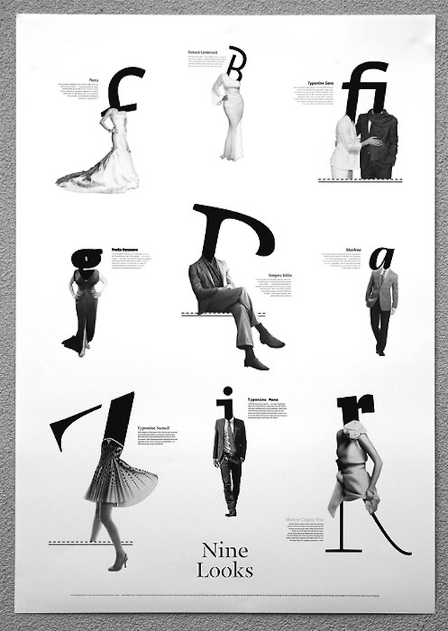
Nine Looks, a type specimen poster for the Typonine type foundry (2010)
Your work covers several categories: posters, books, web, video, visual identity, and beyond. Is there any category that you especially enjoy?
By training and schooling, we’re hardcore graphic designers: our strengths lie primarily in print production. However, we’ve recently been given the chance by Nikola ?urek (of Typonine, the first Croatian digital type foundry) to create a promotional video for his new typeface, Audree. The fact that we were total newbies at this resulted in a lo-fi approach that’s sort of atypical in the world of high-end typography advertising, but the video itself got a great response…. Mr. ?urek later invited us to make another video, this time for his typeface Nocturno.
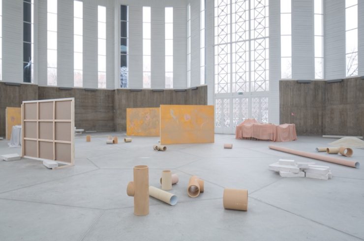
A category we don’t get to work in as often as we’d like is exhibition and spatial design: in 2009, we designed ‘Design Live’, an summation of Damir Brali?’s work up to that date. Seeing your work at such a large scale is odd in contrast to designing small posters and booklets – it’s sort of fun to get to stand inside your own design! At the same time though, nothing beats enlisting the help of a booklet printing company who can help to turn your vision into a wonderful design reality. Even now, after all these years, I still get that overwhelming sense of pride when I see my work in print. It truly is amazing!
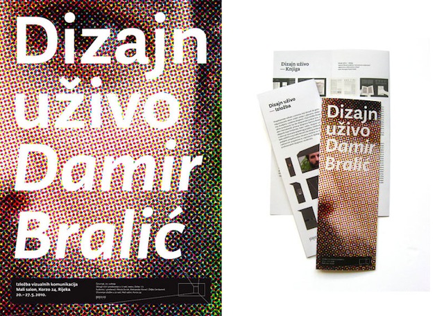
‘Design Live’, an summation of Damir Brali?’s work
How would you describe your aesthetic?
We don’t really have a deliberate aesthetic, at least not when we work together. … We’re not big fans of high-end post-production, so our work ends up being neither very ‘punk’ or lo-fi, nor extremely polished. Of course, these things evolve and change – in graphic design even more quickly than elsewhere.
What are your design values? What constitutes good design?
In Croatian there’s a (French-borrowed) word ‘dezen’ – a simple visual, most often pertaining to furniture, upholstery or wallpaper. The word ‘dizajn’ (taken from English, and in turn from Latin), is similar, but it carries with it the wider meaning of a purposeful intention, a thought that results in a visual or an object.
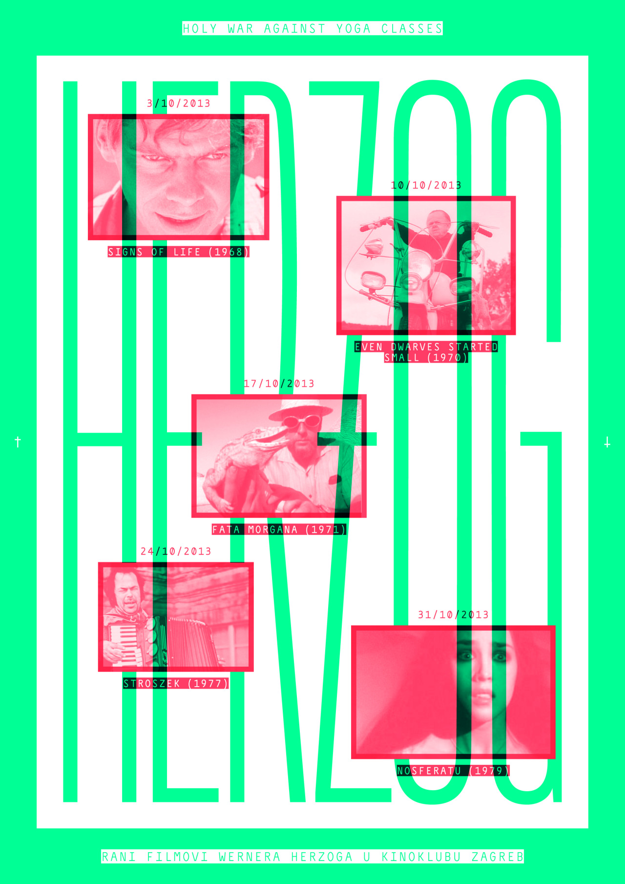
We believe good design is both ‘dezen’ and ‘dizajn,’ thus aesthetically pleasing and culturally, sociologically and contextually relevant. Of course, the needle swings from one to the other – especially in graphic design. Designing visuals for Teatar &TD, we felt it natural to first research their incredible history of graphic design (led by Arsovski and Bu?an in the ‘60s and ‘70s), but also reference the sorry state of the government funding for theatre and culture nowadays. Posters for pop-dance evenings will, of course, reference contemporary pop-culture. But a logotype for a local DJ or posters for movie nights at a youth cinema club can just be pretty, aesthetically pleasing without the pretention of deep thought or a ‘bigger picture’. These are extreme examples, of course, but Croatian designers often decry ‘ornamental’ graphic design as something inherently bad. We think it’s sometimes appropriate, and it can be really good, as well.
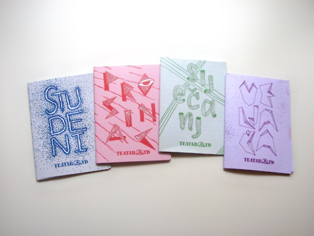
Teatar &TD programs (2010)
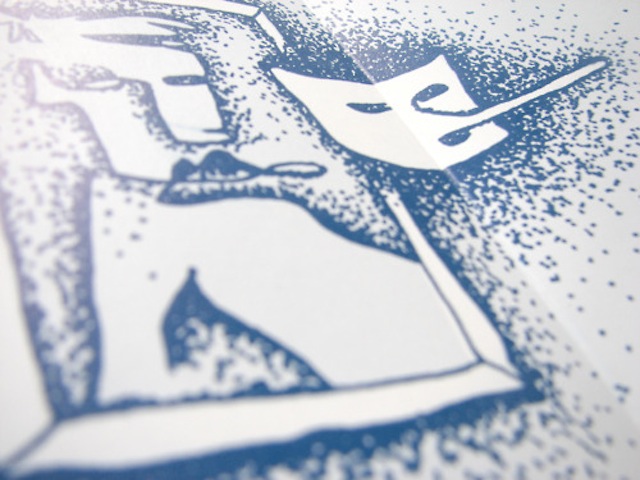
Teatar &TD program detail (2010)
Read part two of our interview with Devi? and Živ?i? here.
Interview by: Elaine Ritchel (@elaineritchel)