Design
Boris Ljubičić: interview with a design icon
One of Croatia’s most prominent designers, Boris Ljubičić is recognized for his research and risk-taking in the fields of design and visual communication. Working across various formats, including television, poster, and web design, Ljubičić is particularly well known for his poster design and his visual identity projects. Since the 1990s, he has energetically taken on the intensive task of rebranding the entire country of Croatia.
Ljubičić heads his own design firm, Studio International, and his work has been included in several international design anthologies, including The Design of Dissent: Socially and Politically Driven Graphics (Rockport) and Squares, Checks, and Grids (RotoVision).
Here, Ljubičić tells us more about his creative background, his approach to design, and the messages behind his visual work.
What are some of your concerns as a designer?
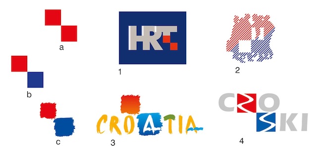
A designer has a responsibility to both time and place, which means that he [or she] is not entirely free in the conception of design. In 1990, with Croatia’s separation from Yugoslavia, it was necessary to devise and design a completely new country. My self-initiated project New Look Croatia was conceived as a visual code based on the historic Croatian coat of arms, which is made up of red and white squares … I have applied [the theme of two squares] to more than 50 new logos and brands, including HRT (Croatian Radio Television), the Zagreb Fair, Croatia National Tourist Board, and CROSKY, the Croatian Ski Association.
")
New Look Croatia (visual code application)
New Look Croatia (visual code application)
I have done all types of design: print, television (animation), and 3D. I think visual identity is certainly the most demanding type of project; it is the most visible and longest lasting. This is particularly important for countries that have emerged from socialism and don’t have their own traditional brands.
My project for the visual identity of the eighth Mediterranean Games in Split in 1979 is now historic, not just in Croatia, but in all of the Mediterranean and beyond. The symbol of the games has become the standard for all the games since 1979. It’s interesting … because I tweaked Coubertin’s Olympic circles and made them blue, which actually opposed the set standards to be followed. My work involves extensive research of the origin of a project, so that it can be realized in a precise design.
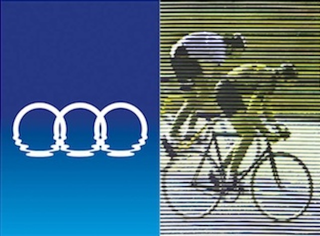
Mediterranean Games (1979)
You have said, “A poster is only a piece of paper.” Tell us more about your approach to poster design.
On the street, the poster is a source of brief information. In museums, it’s an artifact of the past or of a certain trend in design. At first, I didn’t want to do posters, because it was too reminiscent of painting … My first poster was in fact a protest against the design of posters. A narrow strip of fluorescent red had continuous text reading SEVENTH ZAGREB SALON along the edge in black. This poster was hung between or around other posters, framing them as a picture of the state of poster design at the time. Formally, the fluorescent red color continued along the street, and even flowed into the sewer.
My second poster for the fifth Salon of Young Artists was a blank piece of paper “fastened” with four [printed] thumbtacks, while the fifth tack, in the middle, is cut from the paper and projects toward the viewer. The message? Young artists still haven’t done anything – give them paper so that they can try something!
There is one design from the series for the Student Center Gallery for David B. Kisuk’s exhibition that illustrates how beautiful posters can be. Combining two or more posters gives the impression of the rhythmic movement of the brushes used to apply posters, because part of the illustrated brush repeats on the right edge and continues onto the next poster.
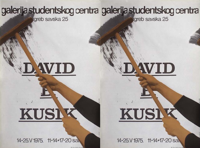
David B. Kisuk exhibition poster at the SC Gallery, Zagreb
Can you tell us a bit about your creative background? When and why did you decide to become a designer?
I studied painting at the Academy of Fine Arts in Zagreb, where I learned traditional painting techniques. When I graduated, I realized that what we were doing at the Academy was valid 150 years ago, and that I was at the Academy that many years too late. I immediately stopped painting, believing that Kazimir Malevich had painted the last painting – Black Square on a White Field – in 1915, and since then, painting as an art was finished!
Design is some kind of sequel, but the work is more prevalent because it communicates with the greatest portion of society. That’s why I loved big projects that had visibility and presence outside museums and galleries, by way of standard media or even better, life.
What have been some of the most important or significant projects for you?
The posters that are actually not only mine – because their messages are of a social nature – although I initiated, printed, and distributed them. On the poster “KRV-ATS-KA!” I added a bit of my own blood, because I wanted to feel its message myself, because just the transformation of the first three letters from HRV to KRV, did not state it strongly enough. [Note: “Hrvatska” is the Croatian word for “Croatia,” and “krv” is the Croatian word for “blood.” Replacing the first three letters of Hrvatska with “krv” comments on the violent circumstances of Croatia’s independence.]
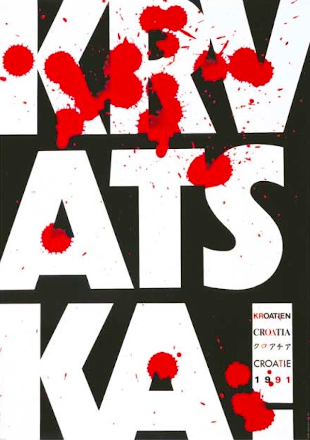
KRV-ATS-KA!
Today the poster is in a book of 100 posters of the 20th century … The choice was made from 300,000 world-famous posters.
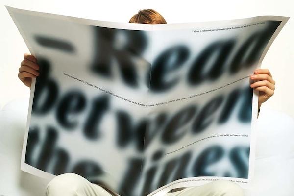
Another poster that I find important is “Read Between the Lines,” which hides its message because the text between [the large letters] is the size of that in a newspaper. You must get closer and read the text yourself and to verify the title, which you can see from far away. The text, of course, isn’t mine. It was written by Croats expelled from Vukovar after November 18, 1991. This poster received several prestigious international awards.
Are you currently working on any interesting projects?
There are many … I am trying to create some educational books; titles include Mediteranske igre / Dizajn projekt, 30 godina poslije (Mediterranean Games / Design project); 30 Years Later; Only Posters, with descriptions of the fifty posters; Croatian is Different, an analysis of the visual identity of 37 countries with a special focus on Croatia, and my personal book INVENTURA (Inventory) … I will single out two visual identity projects that are especially interesting: i-r-b (Ruđer Bošković Institute) and IGH.
Interview by Elaine Ritchel (@eritchel)
Images courtesy of the designer.