Design
Dario Dević & Hrvoje Živčić: Design Collaborators Part II
Last week we spoke with award-winning graphic designers Dario Dević and Hrvoje Živčić about how they met, why they choose to work as a team, and what constitutes good design. In part two of our interview, Dević and Živčić talk inspiration, current work, and future projects.
Do you have any specific influences? Where do you get inspiration?
Živčić: One of the interesting things with influences and inspiration is that they often come from areas other than design and the visual arts. For example… turning to a more intuitive and less structured approach to [my] music, also made my design process less utilitarian and more intuitive.
When talking about designing letterforms, as most type designers I, too, often find myself looking at vernacular typography or old type specimens. I always feel like looking for some undiscovered typographic treasure, and if I find it, the interesting thing is what to do with it and where it takes me.
Dević: Like many Generation Y-ers from this part of Europe, I feel I’ve been raised by lowbrow American sitcoms — maybe that’s why my sensibility in approach to illustration and solo projects often have a fascination with cheap pop-culture, and the visual conceits have a weird setup-punchline rhythm to them. This (sometimes exaggerated) need for pop-cultural relevance sometimes reflects itself as using (or abusing) popular trends in graphic design. I always like to tell myself I do this self-consciously, though.
Hrvoje’s more systematic and cerebral approach and my somewhat chaotic and childish ideas sometimes just cancel each other out, resulting in good, conventional design; but it’s when they sort of click together in unexpected ways that the most exceptional works we’ve created in tandem happen.
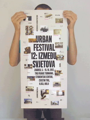
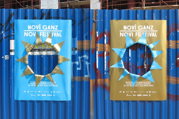
Poster for Urban Festival 2012
What is the climate like for young designers in Croatia? Have you run into any particular challenges or advantages?
[It’s difficult to] draw any general conclusions, as some [designers] end up in agencies doing advertising work, some slowly drift into neighboring disciplines such as illustration, photography, copywriting or art direction, some establish their own small firms and some, like us, freelance in a more-or-less exclusive collaboration with other designers.
For that last category, there have been positive advances in the past several years, many of which are directly linked to propulsive and interesting initiatives of the Croatian Designer’s Association (HDD). They organize various annual and biennial happenings where designers can sell or just present their non-commercial work, and where students can announce themselves to the professional and general public for the first time; they also allow young designers to apply for exhibitions and lead workshops in their small gallery space in the city center.
Do you have a dream project that you would love to work on?
Dević: I love nothing more than spending a couple of hours or days on making a simple poster and being happy with the result. My collaboration with the Cinema Club Zagreb makes me happy [as] I also got to curate some of the projections and choose what films to show! This is as close to a dream collaboration as I’ve gotten yet.
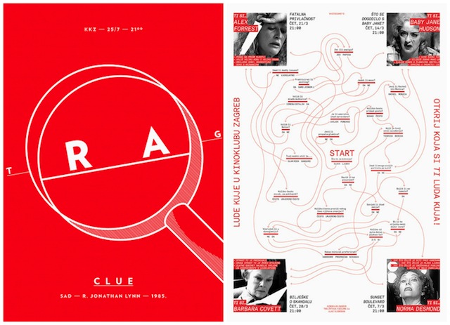
Posters for the Cinema Club Zagreb (2013)
Živčić: I would love to do a custom typeface for a publishing company, a magazine or maybe for a visual identity. The typefaces I have designed so far all started out as non-commissioned work and were more about me learning the trade or just trying to explore and make something I like. But when you don’t have a clear purpose in mind … the decisions are harder to make. I also just like the idea of custom tailoring a typeface for a specific project.
Are you currently working on anything that you can tell us about?
At the moment, we’re very excited to be working on the 13th edition of Urban Festival. It’s a festival dedicated to urban art in the context of the city, not only street and public art, but also different projects that refer to urban themes and issues. The curatorial team [BLOK] always plays with and expands on the concept of the festival itself: the first edition we worked on was imagined as a three-month long work-in-progress, so we printed the materials on our office printer, sometimes only hours before specific performances. In the end, these leaflets would combine into the final poster through a system of intricate marks. This is still one of our favorite designs.
This year, the festival will extend through three years, so right now we’re in the process of setting up a design system that will be susceptible to change and evolve not only with the festival, but also with us as designers. … This idea of creating a fluctuating design project with long-term change as a visual concept is quite exciting! It gives us freedom to try and make the design process become the final product itself.
Živčić: Also, I recently finished a typeface project called Mote. It started during my studies at the Royal Academy of Art in The Hague. Genre-wise, it’s somewhere between neutral gothic and early 20th century grotesque designs. Few quirks aside, it’s basically my take on how these kinds of archetypal letterforms can still be reinvented. It should be published by the end of November through Typonine and will be my first commercially available typeface.
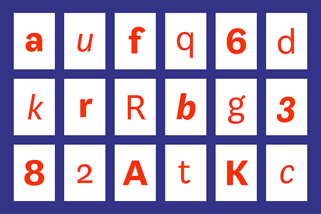
Mote typeface (2012)
Be sure to read part one of our interview with Dević and Živčić!
Interview by Elaine Ritchel (@elaineritchel)